Toronto Metropolitan University
Logo Design and Identity Refresh for The Metropolitan Undergraduate Engineering Society
Unlocking the Potential: Revitalizing the Brand Identity of Metropolitan Undergraduate Engineering Society
Toronto Metropolitan University (TMU), formerly known as Ryerson University, embarked on an ambitious journey to redefine itself. Alongside this transformation, TMU clubs and societies embraced change, including the Ryerson Engineering Student Society (RESS), now known as the Metropolitan Undergraduate Engineering Society (MUES). To bring their vision to life, MUES partnered with The Branded Agency, to create a new logo and identity that is modern yet historically resonant.
In this collaboration, our goal was clear: to craft a new logo and identity that would embody the essence of MUES while paying homage to its rich legacy. We seamlessly merged modern aesthetics with a deep respect for the organization's past, ensuring a visual representation that would captivate both present and future members.
Logo Design
Brand Identity
Brand Guidelines
Creative Assets
What We Did
Contemporary Appeal and a Respectful Nod to Tradition.
In this collaboration, our goal was clear: to craft a new logo and identity that would embody the essence of MUES while paying homage to its rich legacy. We seamlessly merged modern aesthetics with a deep respect for the organization's past, ensuring a visual representation that would captivate both present and future members.
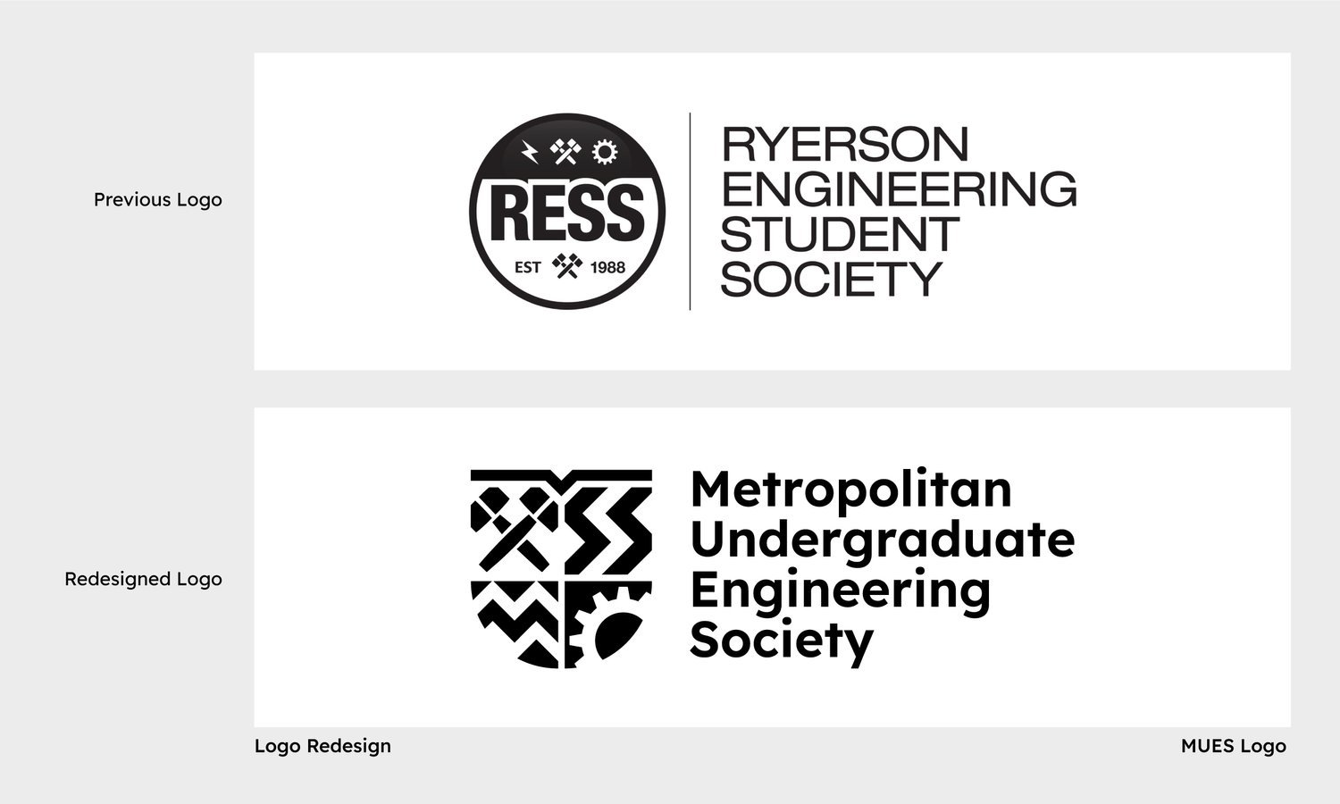
Respecting the legacy of the previous logo, we recognized the importance of maintaining some continuity. We carefully analyzed its elements, incorporating select icons into the new design. By preserving these familiar elements, we seamlessly bridged the gap between the past and the present.
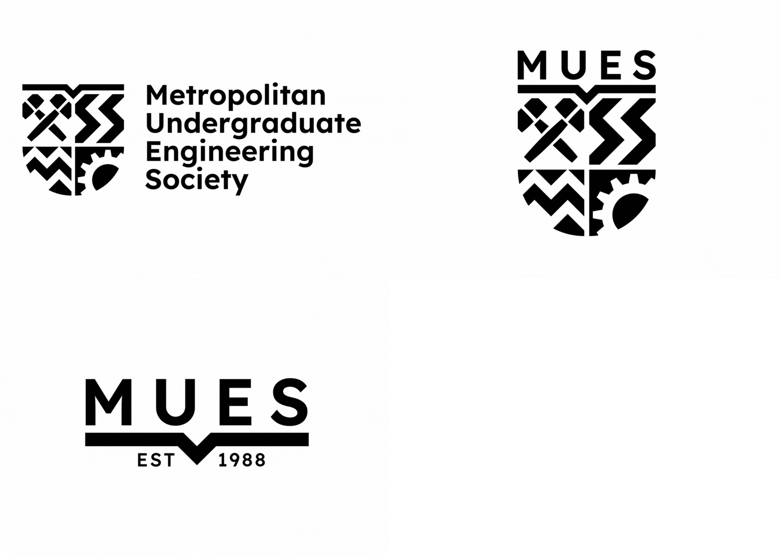
The wordmark, too, received a modern upgrade. We carefully selected a minimal and clean geometric sans-serif typeface to enhance the overall brand image. The font choice, with its sleek and timeless appeal, perfectly aligned with our vision of a modern and friendly brand identity for MUES.
Crafting a Cohesive Brand:
Elevating MUES's Visual Identity
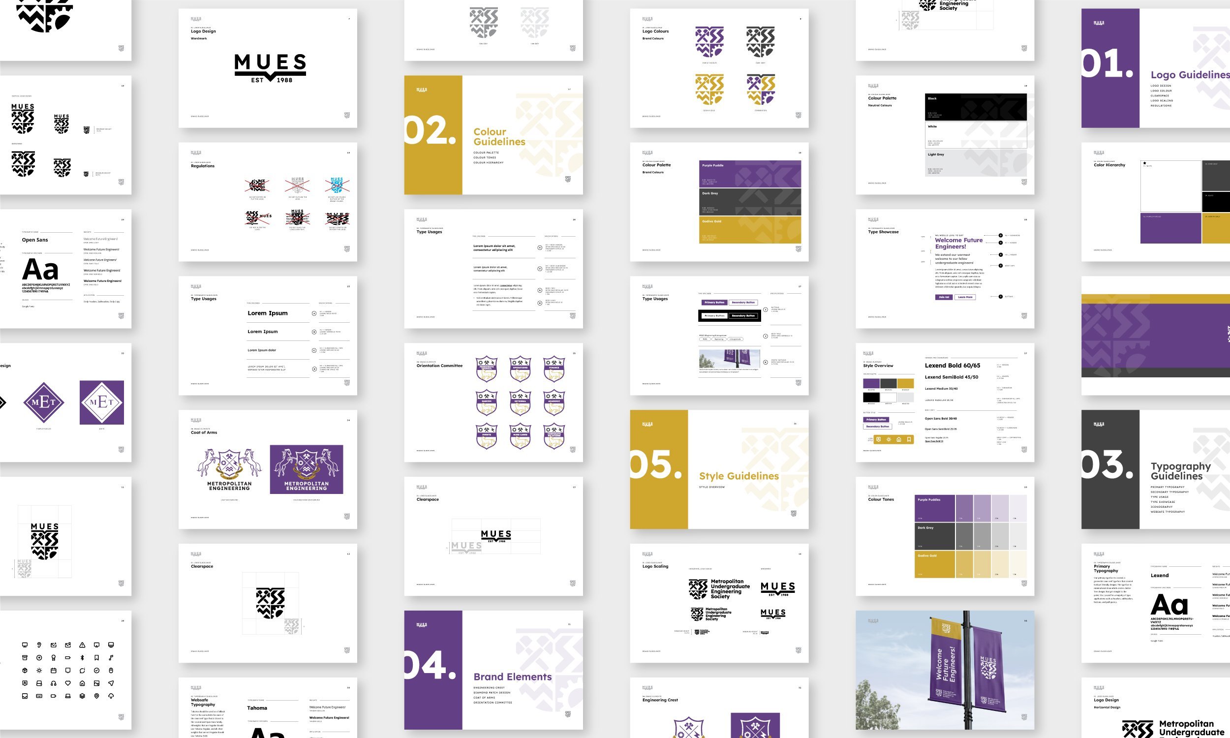
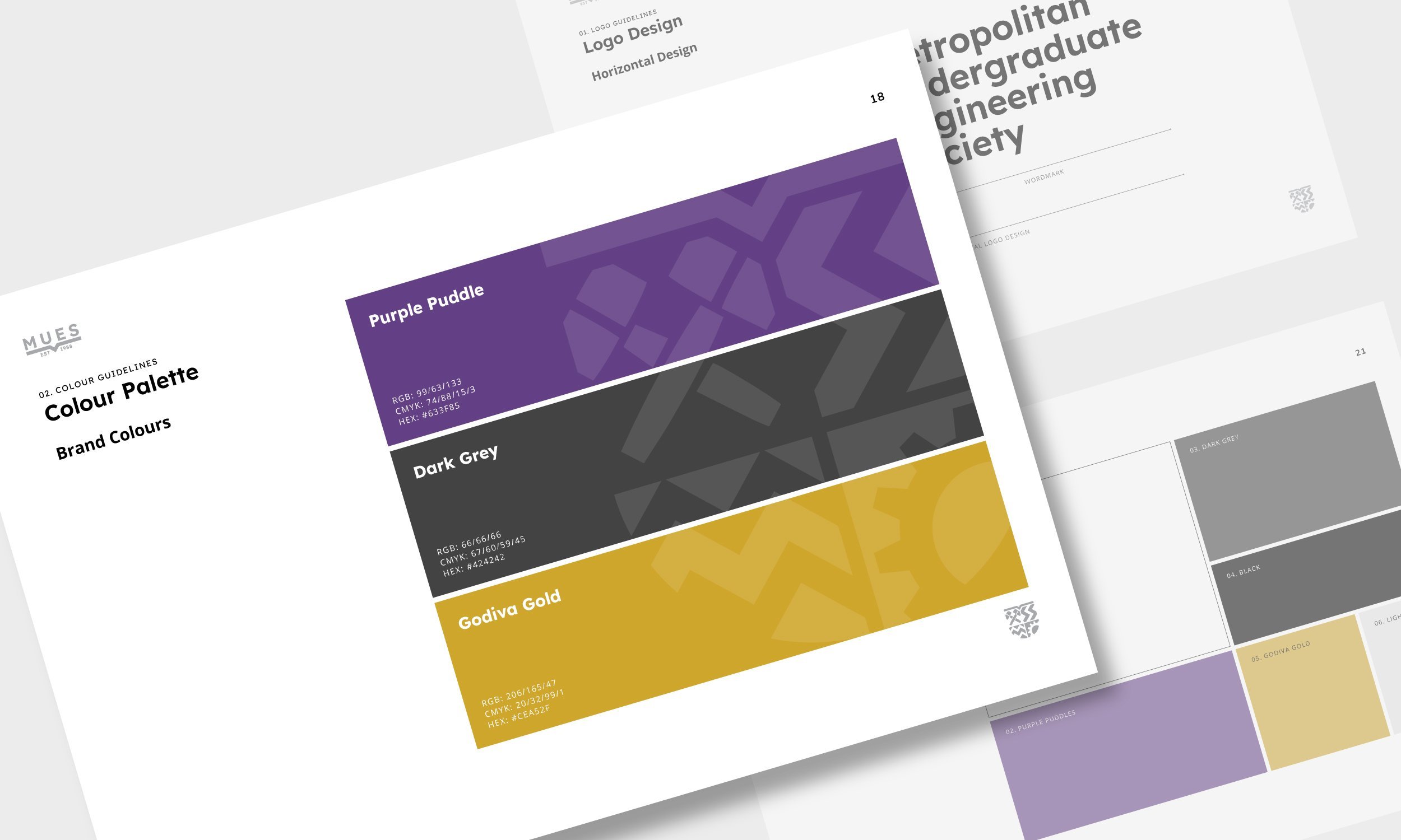
In addition to the main logo, we recognized the importance of developing brand elements that would align seamlessly with the new MUES brand identity and create a consistent and professional image.
Our task was to modernize these emblems while ensuring they harmonized with the new brand identity.
Following a similar approach as the main logo, our team employed clean lines and simple shapes to redesign the emblems. The goal was to create a sleek and contemporary design that would enhance versatility and adaptability across various applications.


