Workling
What We Did
Brand Positioning
Logo Design
Brand Identity
Web Design
Finding a job, and hiring the perfect candidate are both sides of the same coin. The market is growing larger with more jobs and candidates, with a need for experienced professionals. A constant flow of applications and portfolios can create a headache without end, like looking for a needle in a haystack.
Workling was created to reduce the stress and efforts in finding the perfect candidate for your projects, and makes the process of hiring so much easier. The right candidates are offered for your projects through a vetting process that assesses both the candidate’s qualifications and personality to ensure they are the right match for your project. An innovative streamlined process in finding the perfect candidate for your business within a space is what Workling achieves.
The Brief
Workling asked us to create a logo, with an accompanying brand identity, that we also incorporated into a website design. After we helped build a brand positioning guide, and a communication guide, we were able to create a strong logo and brand identity for Workling. The brand identity was created to reflect their brand values, and appear fun, approachable, and engaging through vivid colours, design elements, and imagery.
Logo Design
The logo consists of a brandmark and a wordmark, designed to work together or independently and appears fun, engaging, and modern. The brandmark is designed to appear as intertwined loops or a knot that also incorporates the letter W within the brandmark. Each loop in the logo signifies Companies, Candidates, and Workling, that work together to create interconnected relationships. The brandmark appears fun and open, with the brand elements being derived from the brandmark as well. The wordmark is designed to appear friendly, and open using lowercase letters with a modern sans-serif typeface.
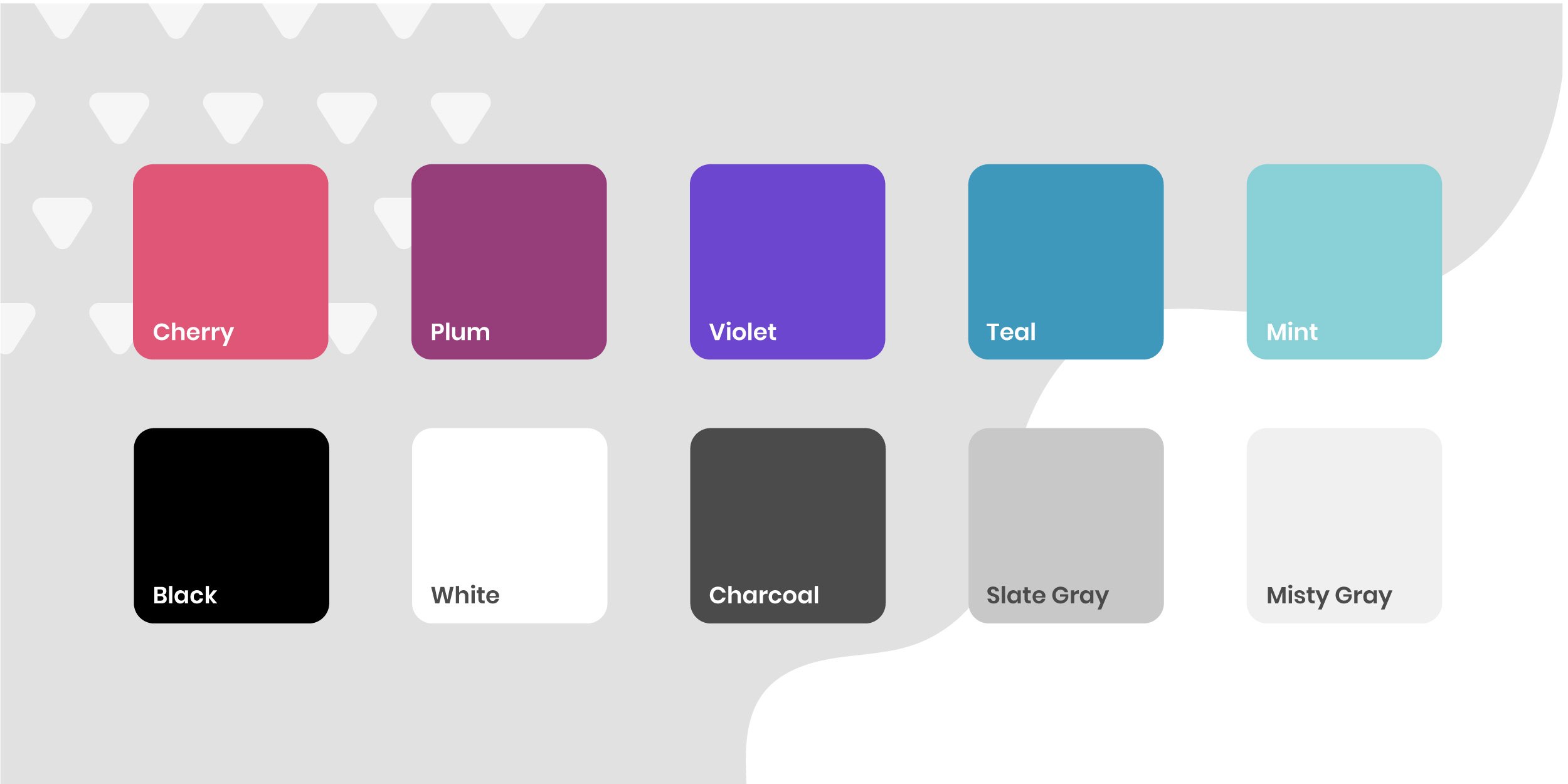
Workling Colour Palette
The colour palette for Workling is designed to work well independently or together, especially as gradients. We chose to incorporate a lot of gradients into the brand identity to create a fun, dynamic, and engaging brand identity that is also innovative and modern. The neutral tones are used to counter the bright vivid colours and create a sense of balance and calmness in the designs. The gradients can be used for background, design elements, or buttons in projects, and webpages.
Website Design
We also designed a website for Workling by incorporating the brand identity throughout the project. Utilizing the brand elements, photography, illustrations, and typography we established for their brand guidelines. The webpages are designed to be engaging and dynamic through the use of gradients and design elements. The photography and illustrations also create a sense of engagement making it relatable and easy to understand.
Brand Guidelines
The Brand Guidelines helps organize and solidify the brand identity through pages of logo guidelines, colour palette, typography, photography, and more. The guideline also covered social media for Instagram profile, posts, and stories. The guidelines is also an extension of the brand identity and utilizes and showcases the brand design.


