Winning with Winners and Whiners: A Branding Success Story
What We Did
Brand Positioning
Logo Design
Brand Identity
Brand Bible and Guidelines
As the trusted branding partner of Winners and Whiners, The Branded Agency understands that sports are more than just a game. They bring communities together and create a passionate following. That's why we're proud to work with Winners and Whiners, a premier source for precise analysis and predictions for every major sport in America.
Their high-quality content is backed by statistics, research, trends, and insight, making their analysis reliable and trustworthy. Whether you're a die-hard fan cheering in a stadium or celebrating with friends and family at home, you can count on Winners and Whiners' expert analysis.
At Winners and Whiners, they're committed to being up-to-date and engaging, and that's why they underwent a recent rebranding. Their refreshed logo, newly designed mascot, modern color palette, and redesigned typography make them more vibrant and engaging than ever before.
Their brand message reflects their core values of precision, professionalism, and passion. They took a clean, minimal, and modern approach to their logo, photography, custom iconography, and website design.
Join the Winners and Whiners community of long-time fans and newcomers alike, and use their free picks to make your best bet with confidence. And don't miss out on their exclusive Tuesday night specials for even more opportunities to win big.
If you're in the sports betting and gambling business and need help with branding and marketing, The Branded Agency is here to help. As a full-service digital branding agency, we can elevate your brand experience for your customers and amplify your message to increase revenue.
Contact us today for a free 30-minute strategy session and get ready to take your brand to the next level, just like Winners and Whiners did.
Logo Design
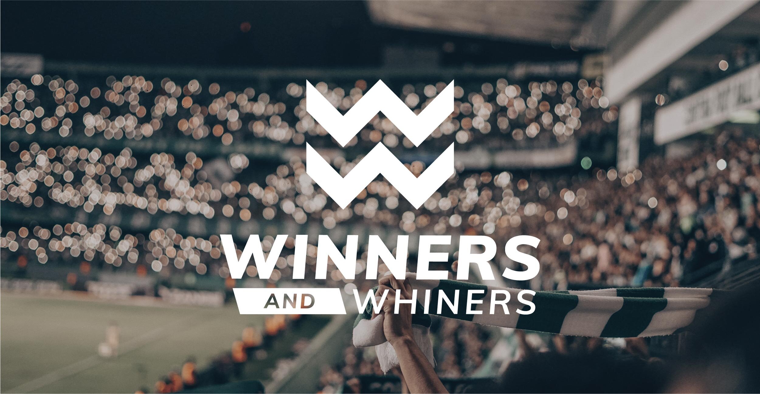
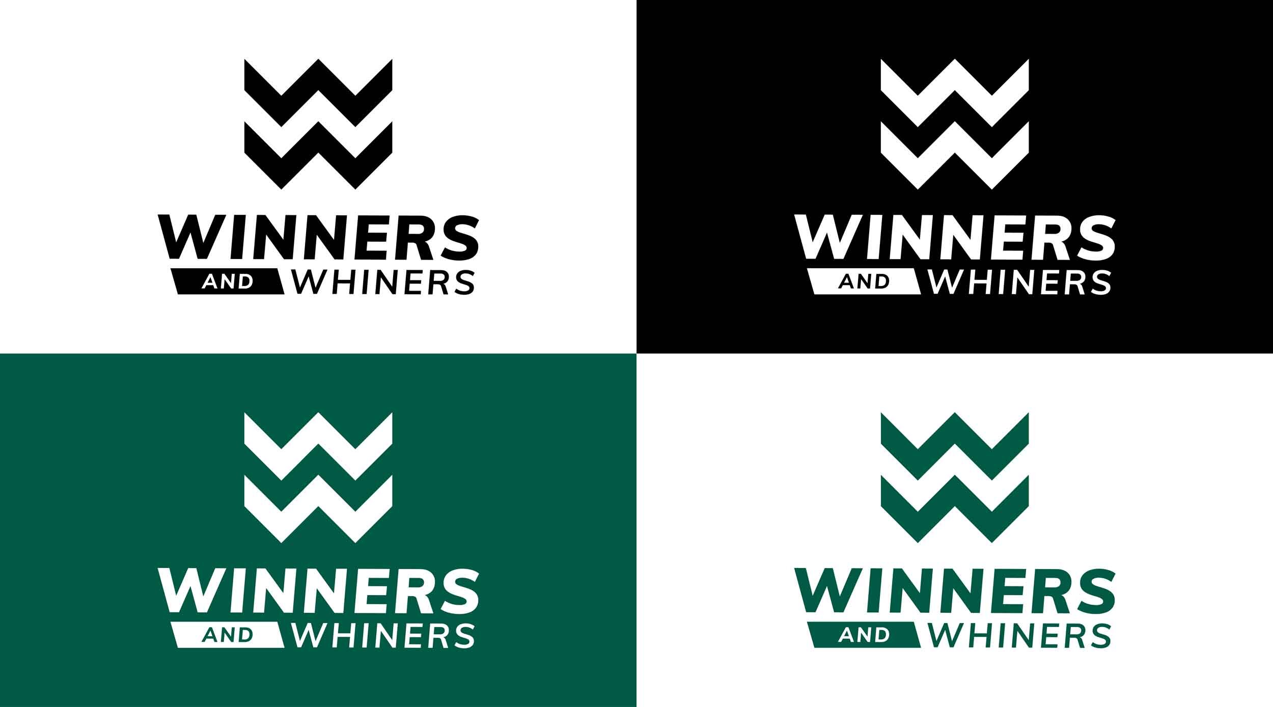
The Branded Agency's designers approached the Winners and Whiners logo with a focus on simplicity and minimalism. By stacking two Ws together, they created a symbol that not only represents the brand name but also resembles a crown. The use of clean-cut lines and angles represents preciseness and professionalism, while the attention to details, such as the aligned slant of the Ws and the boxed "AND" in the wordmark, solidify the brand identity. To create a sense of balance and movement, the designers opted for italicized letters, resulting in a timeless logo that conveys the brand's values and mission.
Modern, Clean, and Minimal Logo
At The Branded Agency, we presented Winners and Whiners with several logo options, each with its own unique style and approach. While some designs incorporated elements from their previous logo, others were more abstract and experimental. Ultimately, they selected the stacked W design due to its modern, clean, and minimalistic aesthetic that is versatile and adaptable across various applications, including photography.
Winners and Whiners Colour Palette
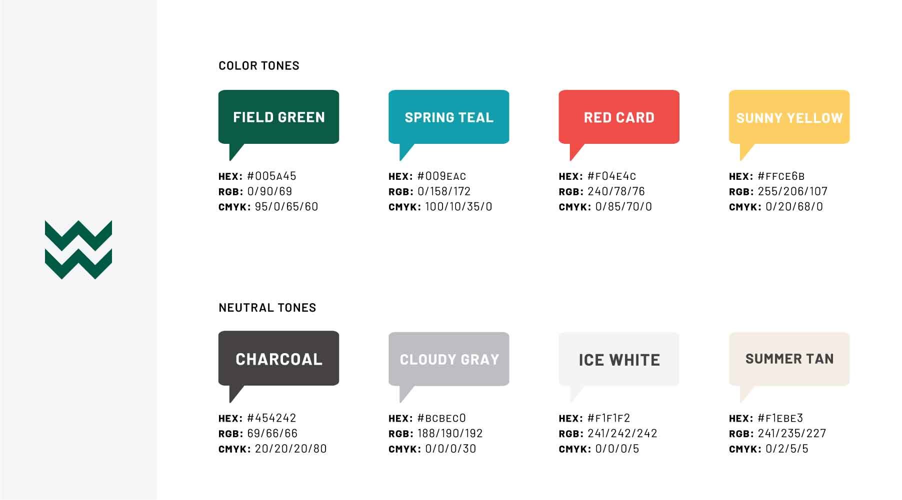
At The Branded Agency, we made a conscious decision to use neutral tones in the design of Winners and Whiners' brand identity. This approach not only brings clarity to the overall design but also helps to accentuate the color palette. While we did not make significant changes to their existing color scheme, we did replace the previous teal with a deeper, richer green that conveys a more professional and sports-centric image.
This shade of green represents the lush fields of a soccer match, the verdant grass of a baseball diamond, and the bright lights that illuminate the arena, all of which are integral to the sports experience.
Website Design
At The Branded Agency, we presented Winners and Whiners with various website design options that would resonate better with their community. These designs utilized custom iconography and photography to create a more immersive and engaging experience for their users.
Brand Identity and Guidelines
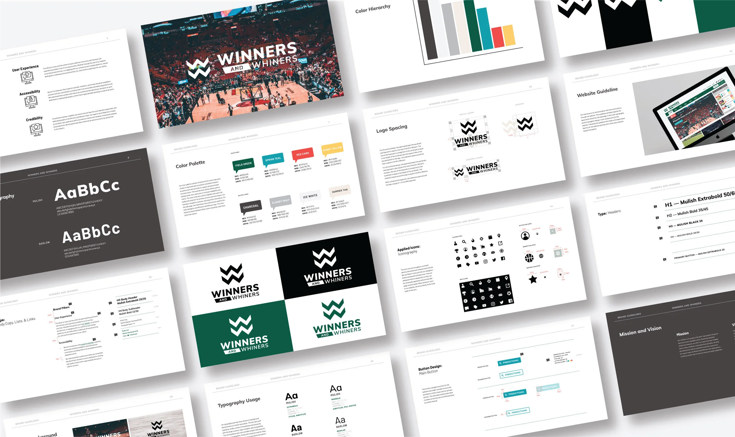
At The Branded Agency, we take branding seriously, and our work for Winners and Whiners was no exception. We created a comprehensive set of brand guidelines to ensure that their brand identity was consistent and cohesive across all platforms.
The Brand Guidelines we created for Winners and Whiners covers a range of elements, including logo guidelines, color palette, typography, website design, photography, and more. Each page of the guidelines is carefully crafted to explain the process and inform the reader of the steps to using elements of the brand identity effectively.
The logo guidelines page is particularly important, as it outlines the proper usage of the new logo in different contexts, such as on various backgrounds and in different sizes. We also provided examples of how the logo should and should not be used, to ensure that the logo is always presented consistently.
The color palette page includes the primary and secondary colors used in the brand identity, as well as examples of how they can be used together in different combinations. We also explained the reasoning behind the choice of colors, such as the use of a deeper, richer green to represent a more professional sports identity.
Typography is a crucial element of any brand identity, and we made sure to choose a font that was modern, clean, and easy to read. We provided guidelines for how the typography should be used in different contexts, such as headings and body text, to ensure that the brand identity is always presented consistently and professionally.
In addition to the logo, color palette, and typography, we also created guidelines for website design, photography, and custom iconography. We provided examples of engaging and visually appealing website designs that would be appealing to their community, and we also developed custom iconography and photography that complemented the overall brand identity.
Overall, our Brand Guidelines for Winners and Whiners helps to organize and solidify their brand identity, ensuring that it is presented consistently across all platforms. By following these guidelines, Winners and Whiners can maintain a strong and recognizable brand identity that will resonate with their audience and help them to stand out in a crowded market.


