Unleashing the Sole: A Branding Case Study for Sneakertopia, Where Sneaker Culture and Streetwear Collide
Sneaker culture is not just a trend, but a thriving community of art, music, and fashion enthusiasts. From a simple need for comfortable and stylish footwear, it has grown and expanded into a diverse representation of style that transcends generations. Sneakertopia, the iconic cultural museum celebrating this movement, approached The Branded Agency with an exciting challenge: to update their brand identity, design their new store for the museum, and create brand guidelines and a brand communication strategy.
As a pioneer in the sneaker culture movement, Sneakertopia wanted to ensure that their message resonated consistently with audiences worldwide. Their dedicated cultural museum connects sneaker culture with both a physical space and augmented reality, creating interactive experiences for anyone in search of creativity and community. The exhibition combines sneakers, streetwear, art, music, and more into an unforgettable experience that inspires and influences sneaker culture.
Companies from around the world have reached out to Sneakertopia in hopes of expanding the exhibition globally. To facilitate this growth, they sought The Branded Agency's expertise in creating a clear brand identity and detailed brand guidelines that would translate well in other cities and countries. Our team delivered a bold, modern, and elegant brand identity that reflects Sneakertopia's vision through neutral colors, custom iconography, and stunning photography.
In addition to updating the brand identity, we designed the new store for the museum and created brand guidelines and a brand communication strategy. With our guidance, Sneakertopia can continue to thrive and inspire sneaker enthusiasts worldwide. Join the movement and experience Sneakertopia for yourself. With The Branded Agency's expert guidance, this cultural icon will continue to push the boundaries of sneaker culture for generations to come.
Sneakertopia Colour Palette
At The Branded Agency, we carefully chose black and white as Sneakertopia's primary colors because of their high contrast and boldness, which make designs stand out. These colors work seamlessly with the neutral grey tones of the secondary color palette, creating a cohesive and timeless look.
Neutral colors are incredibly strong on their own and serve as an excellent foundation that accentuates other design elements. The tertiary colors are reserved for rare occasions or used exclusively for their secondary brand, Frugal. This color scheme creates a timeless and sophisticated look that aligns with Sneakertopia's brand vision and values.
Photography and Textures
At The Branded Agency, we wanted to showcase the true essence of Sneakertopia and its community in their brand guidelines. We used photographs of the exhibition's diverse community, featuring people of all genders, colors, and ages. These photos capture the vibrant energy and inclusivity that Sneakertopia embodies.
For the brand identity, we chose textures that complement the primary and secondary color palettes, which are based on achromatic photography.
The textures are timeless and give a sophisticated look that accentuates the black and white photography. These textures are also used to create a striking background for the Sneakertopia logo or to highlight other color photographs. Our goal was to create a cohesive and visually stunning brand identity that truly represents the Sneakertopia experience.
The Workshop 3D Rendering
At The Branded Agency, we delivered a comprehensive solution to Sneakertopia's need for a new workshop. Our team created a floor plan and provided a realistic 3D rendering that brought their vision to life. We also incorporated new trends like NFTs into the store concept to keep up with the ever-evolving sneaker culture movement.
The workshop was designed with a focus on Sneakertopia's merchandise and brand identity, with the ability to switch out merchandise and props for featured artists or seasonal elements. This allows the workshop to stay current and exciting for visitors. Our team ensured that the space was both functional and visually appealing, creating an immersive experience for anyone who visits.
Brand Guidelines
At The Branded Agency, we understand the importance of maintaining a consistent brand identity across all platforms and touchpoints. That's why we created a comprehensive Brand Guidelines document for Sneakertopia that serves as a roadmap for all brand-related decisions.
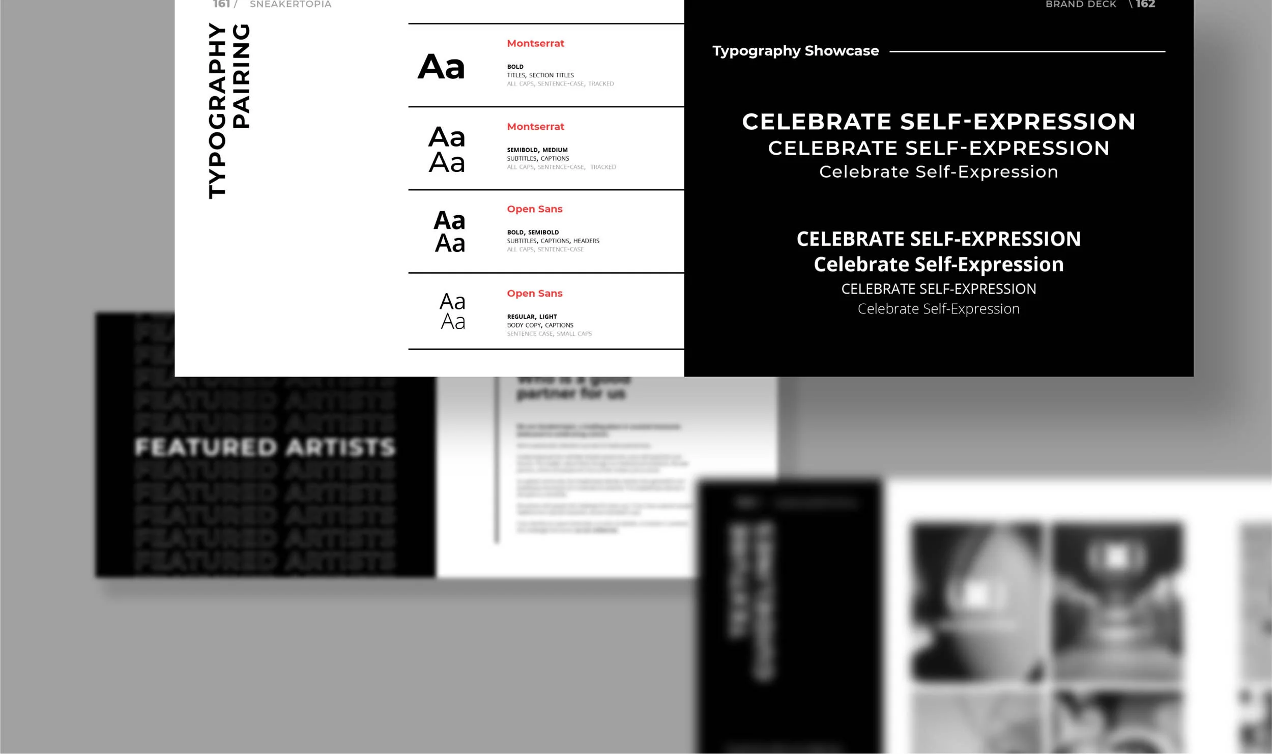
The Brand Guidelines document is a vital tool that helps to ensure consistency and clarity of the brand identity. It's a comprehensive manual that outlines the proper use of the brand's logo, typography, color palette, photography style, and more. Each page of the document is carefully designed to educate the reader on the proper use of these elements.
We believe that the guidelines should not just be a set of rules, but a way to inspire creativity within the brand identity. We encourage brands to push boundaries within the guidelines, but always with the brand's core values and vision in mind. By providing a clear and comprehensive set of guidelines, we empower our clients to make informed decisions and create a cohesive brand experience across all channels.
The Brand Guidelines document we created for Sneakertopia is an essential tool for maintaining the integrity and consistency of the brand identity, from the museum's physical space to its digital presence. It is a valuable resource that ensures that every piece of content created under the brand's name reflects the brand's values and vision, regardless of who creates it or where it is displayed.


