National Beauty
Crafting Beauty's Future: Creating National Beauty's Bespoke Beauty Brands
Step into the world of beauty, where creativity and passion collide, and extraordinary brands are born.
Meet National Beauty, the powerhouse that stands tall as Ireland's unrivaled importer and wholesaler for the beauty, hair, and cosmetics industry. Not content with simply distributing top-tier brands like Kevin Murphy, Aveda, and Living Proof, National Beauty had a bigger dream - to craft their very own line of products that fill untapped niches in the market.
We've brought our extensive expertise in crafting irresistible beauty brands to the table, and together with National Beauty, we've conjured up a captivating suite of brands spanning from mesmerizing eyelashes to top-of-the-line haircare and science-backed skincare products.
At The Branded Agency, our passion lies in the art of naming, shaping brand identities, finding the perfect market position, and designing alluring packaging. We've woven our expertise into every aspect of these brands, ensuring that each one tells a compelling story that resonates with the hearts of beauty enthusiasts.
Brands Created
Littl
Power Formula
Pure Lashes
The Wanted
Clarity Lab
Littl
Brand Identity and Packaging Direction for Littl - kids' haircare.
Salon Quality Haircare for Kids, Gentle on Little Ones and the Planet
At The Branded Agency, we had the honor of crafting a revolutionary new brand redefining how kids' haircare is perceived. Our mission was clear - to present Littl as the ultimate salon-quality solution that is not only safe and gentle for children but also environmentally conscious.
Imagine a product that seamlessly blends into any salon shelf, right beside premier haircare brands. That's Littl - a game-changer in the realm of kids' haircare. We've carefully crafted its brand identity to exude quality, reliability, and care for both little ones and the world they grow up in.
With Littl, children can now enjoy salon pampering and top-notch haircare, specially formulated for their delicate hair and sensitive scalps. Our dedication to safety and the environment shines through every aspect of this exceptional brand.
What we did:
Naming
Brand Positioning
Logo Design
Brand Identity
Packaging Direction
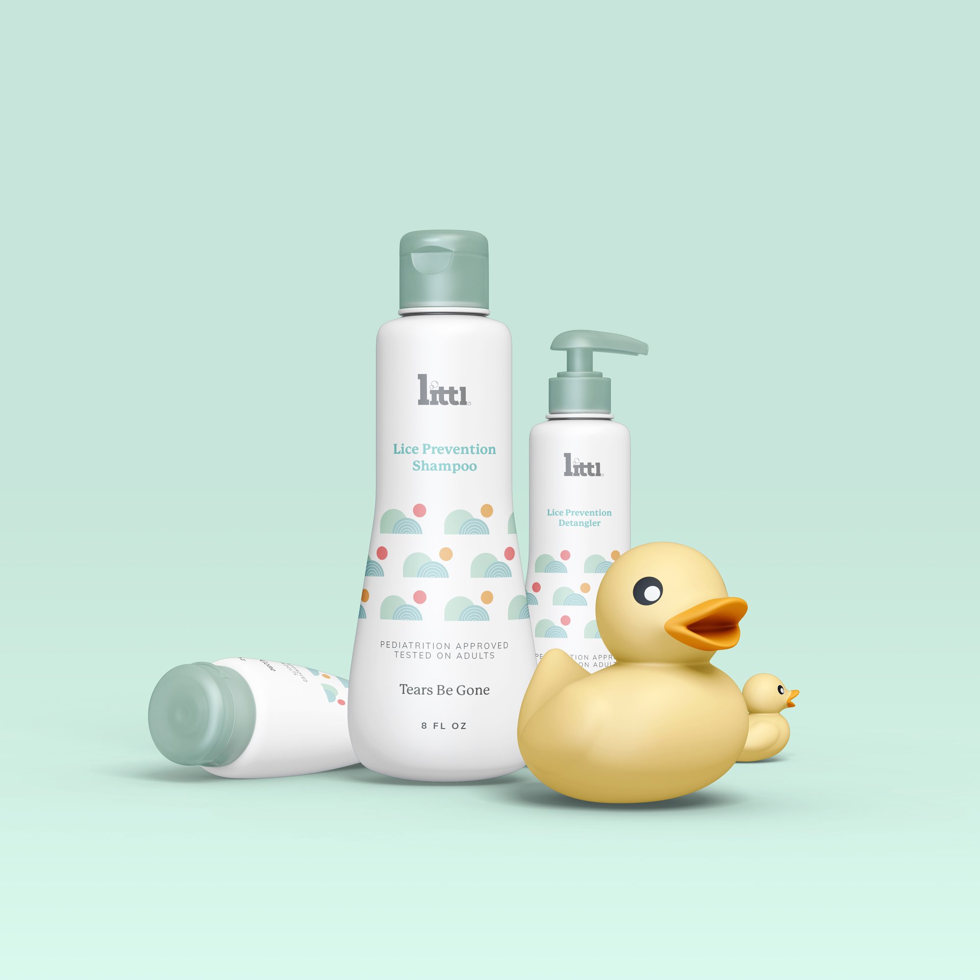
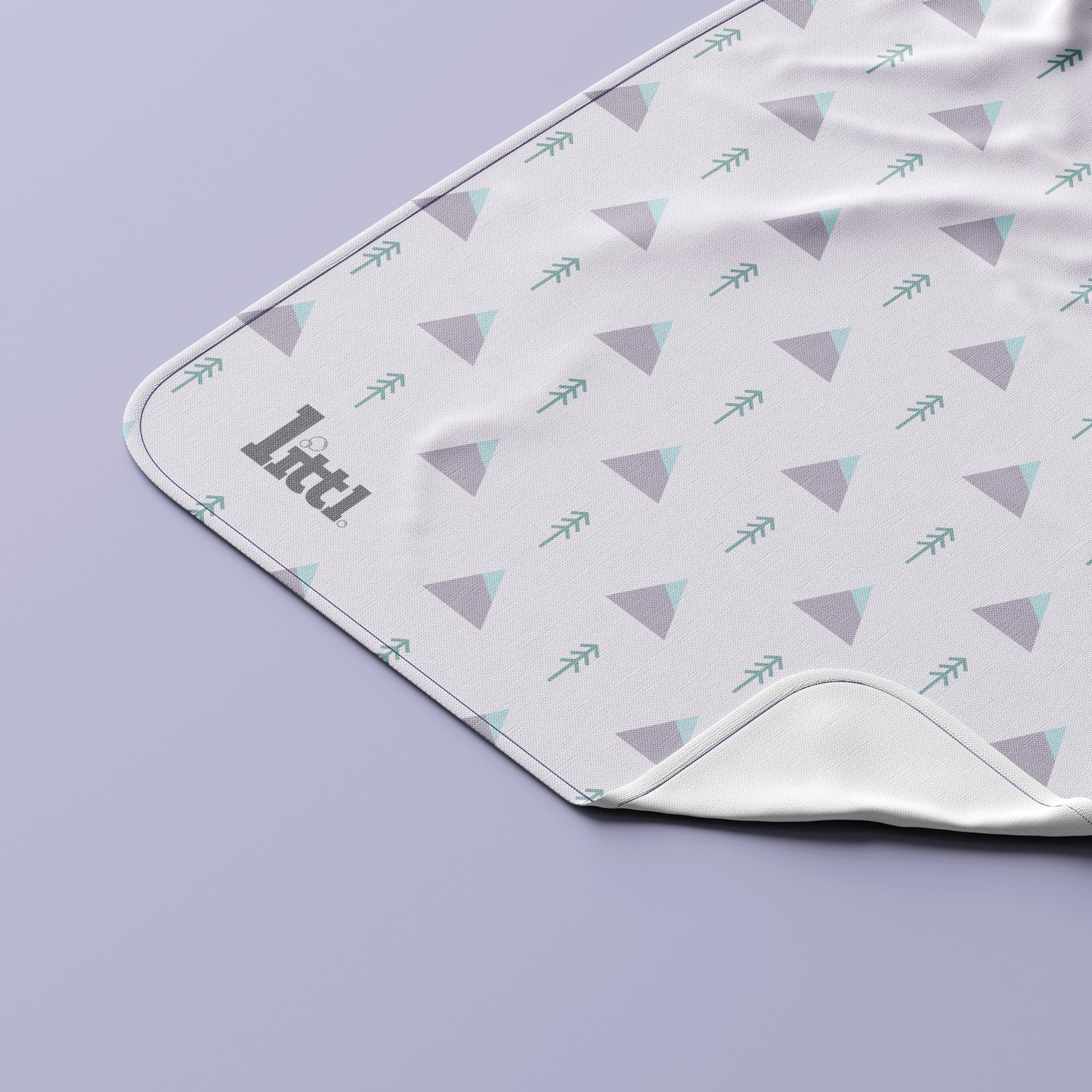
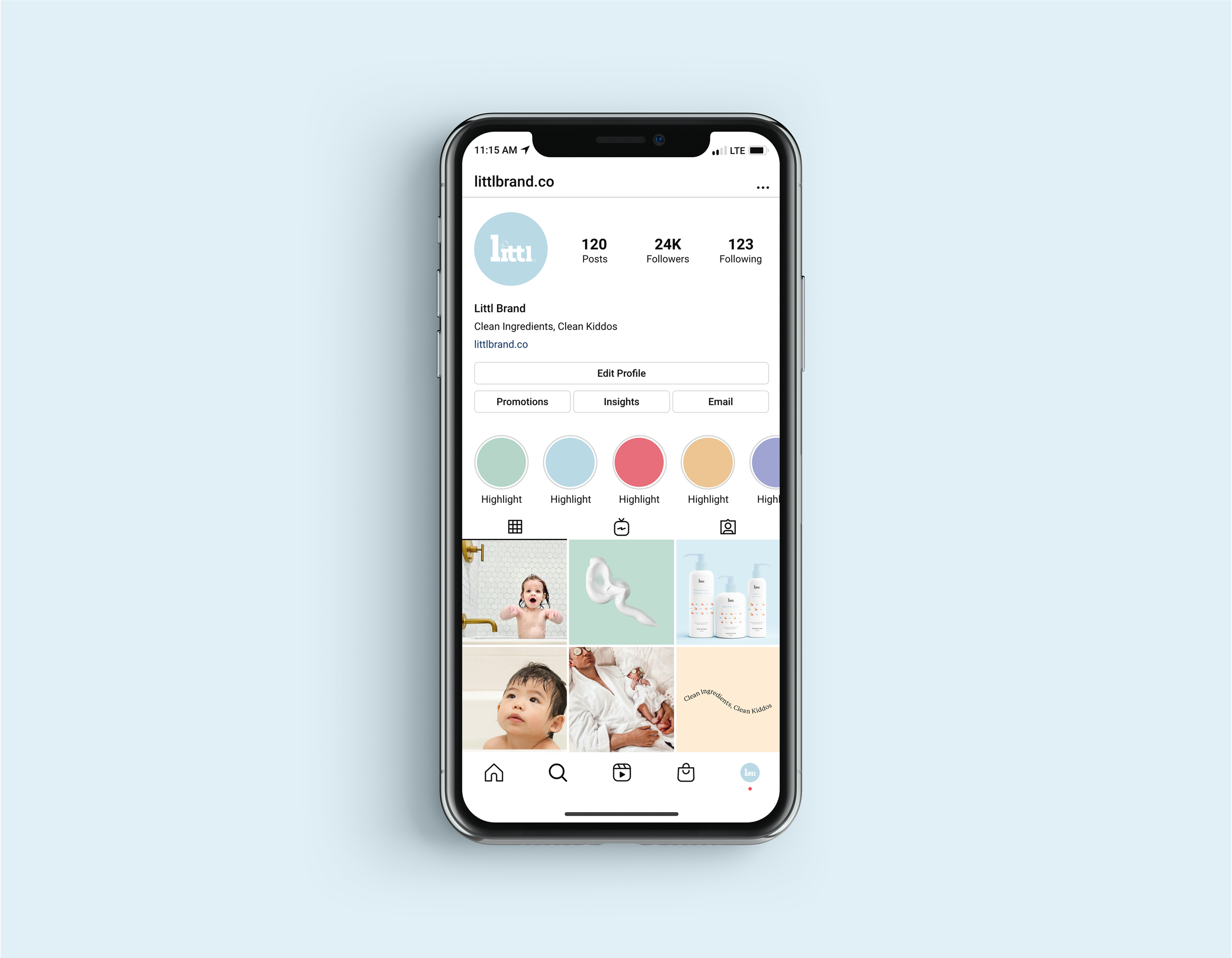
Where Whimsy Meets Salon-Quality Care for Little Ones
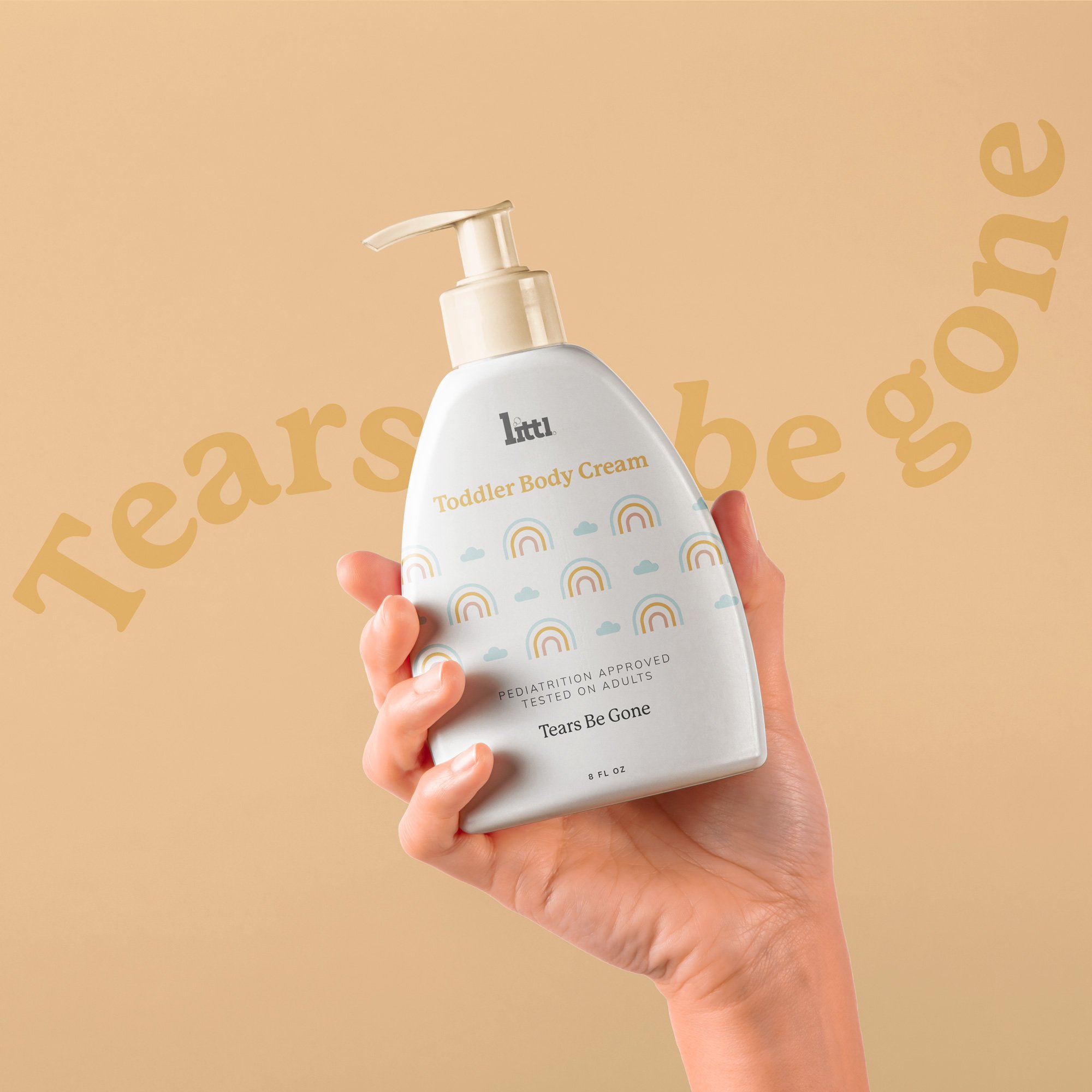
Step into the enchanting world of "Littl" – a name born from playful imagination, a delightful twist on "little" that we carefully conjured. Its simplicity, relatability, and age-appropriate charm effortlessly capture the hearts of kids and parents alike, making it an unforgettable and magical choice. With "Littl," every day is filled with wonder, where salon-quality care meets boundless joy for our precious little ones.
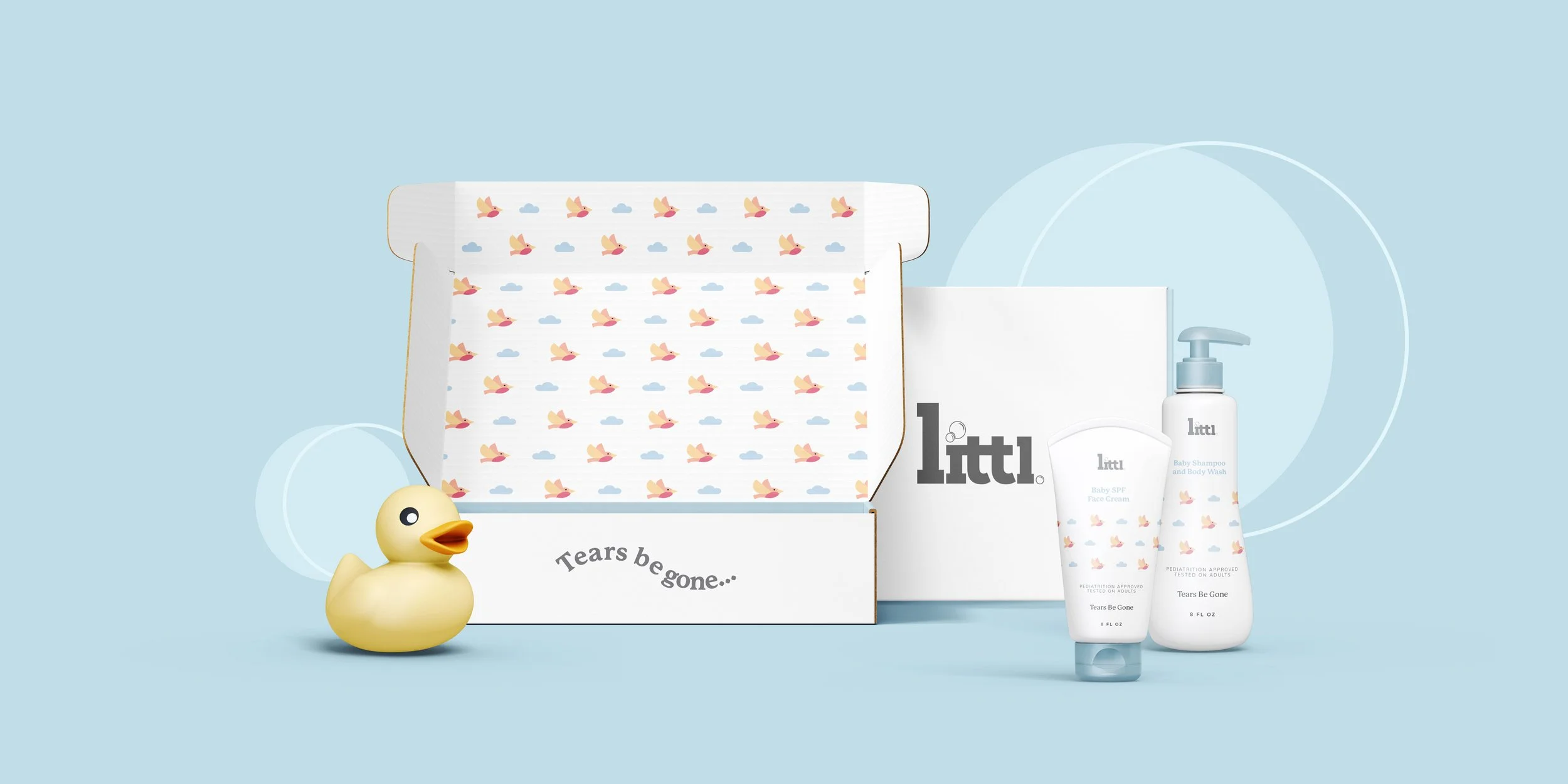
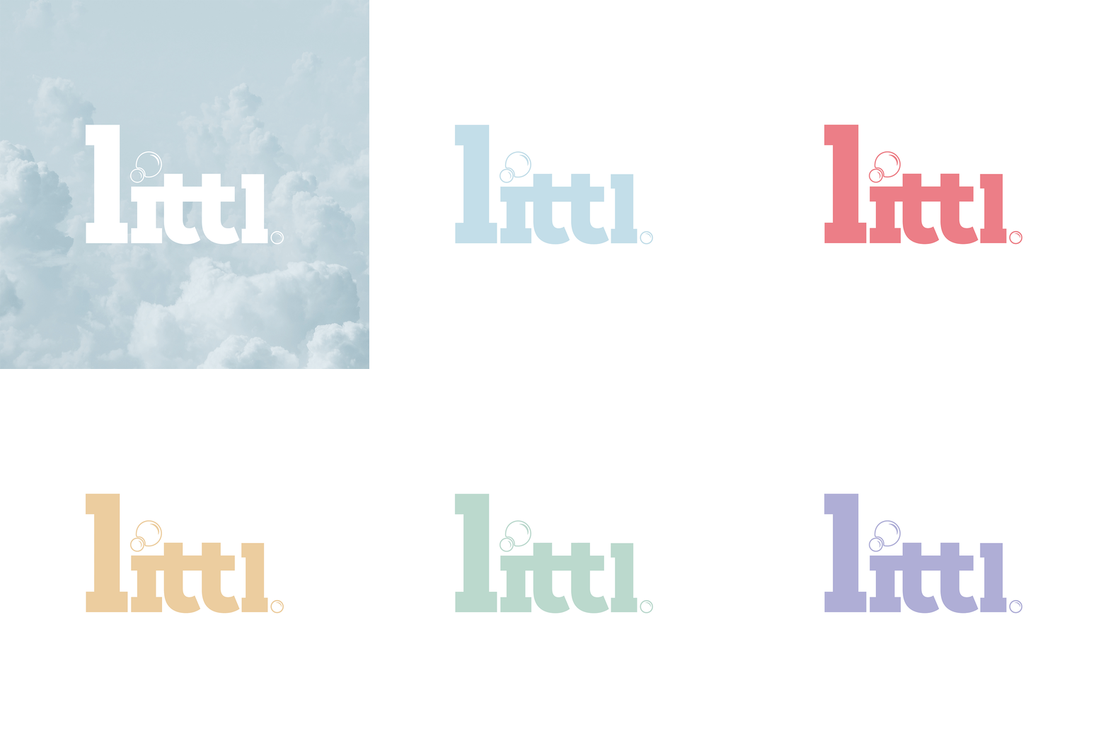
The logo is designed to be bold and easily legible, with a cleverly placed bubble completing the letter "I"
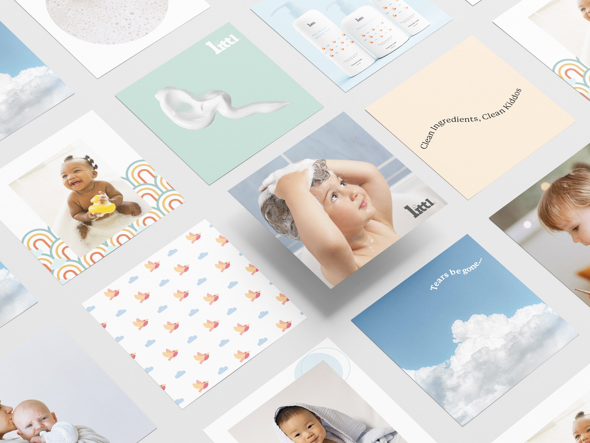
Enchanting Visual Identity: Capturing the Joy of Childhood Bath Time with Littl
For the visual identity of Littl, we delved deep into the heartwarming moments that make bath time a cherished experience for kids. Each image chosen showcases the pure delight and happiness of children splashing around, wrapped in bubbles, and during their bath routines. These snapshots of joy create an emotional connection with the audience, tapping into the heart of what Littl stands for – creating magical and memorable haircare moments for little ones.
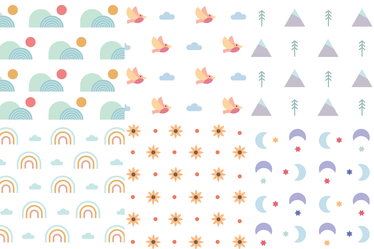
To complement the playful spirit of the brand, we designed sweet patterns that weave a sense of whimsy into Littl's visual language. These patterns add a touch of enchantment and invoke a feeling of adventure, making every interaction with the brand a delightful experience.
Additionally, a youthful color palette was thoughtfully crafted to differentiate the various product lines within Littl. Each color reflects the essence of the specific range, bringing a sense of personality and character to the individual products. From soothing pastels to vibrant hues, every shade is carefully chosen to evoke the emotions and qualities that align with the unique attributes of each haircare range.
Power (Formula)
Brand Identity and Packaging Direction for Power Formula, Scientifically-Driven Skincare Brand
Redefining Beauty: Introducing a Scientifically-Driven Skincare Brand that Marries Elegance and Simplicity
In a landscape saturated with myriad skincare choices and overblown claims, National Beauty perceived a gap. Alongside The Branded Agency, they pioneered an innovative skincare brand, one that combines advanced science and the elegance of simplicity. Welcome to a fresh perspective on skincare that places your skin's health at the forefront, demonstrating that less can indeed be more.
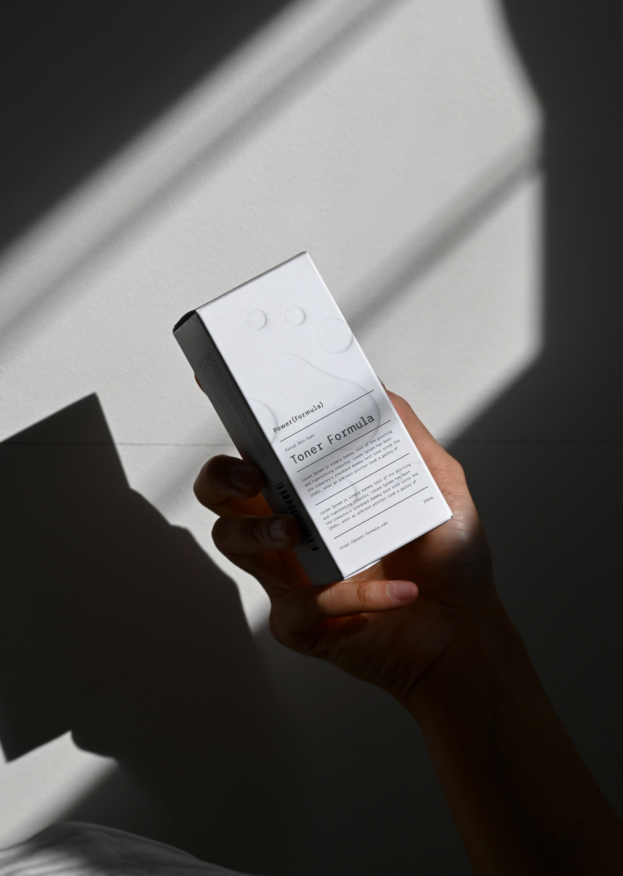
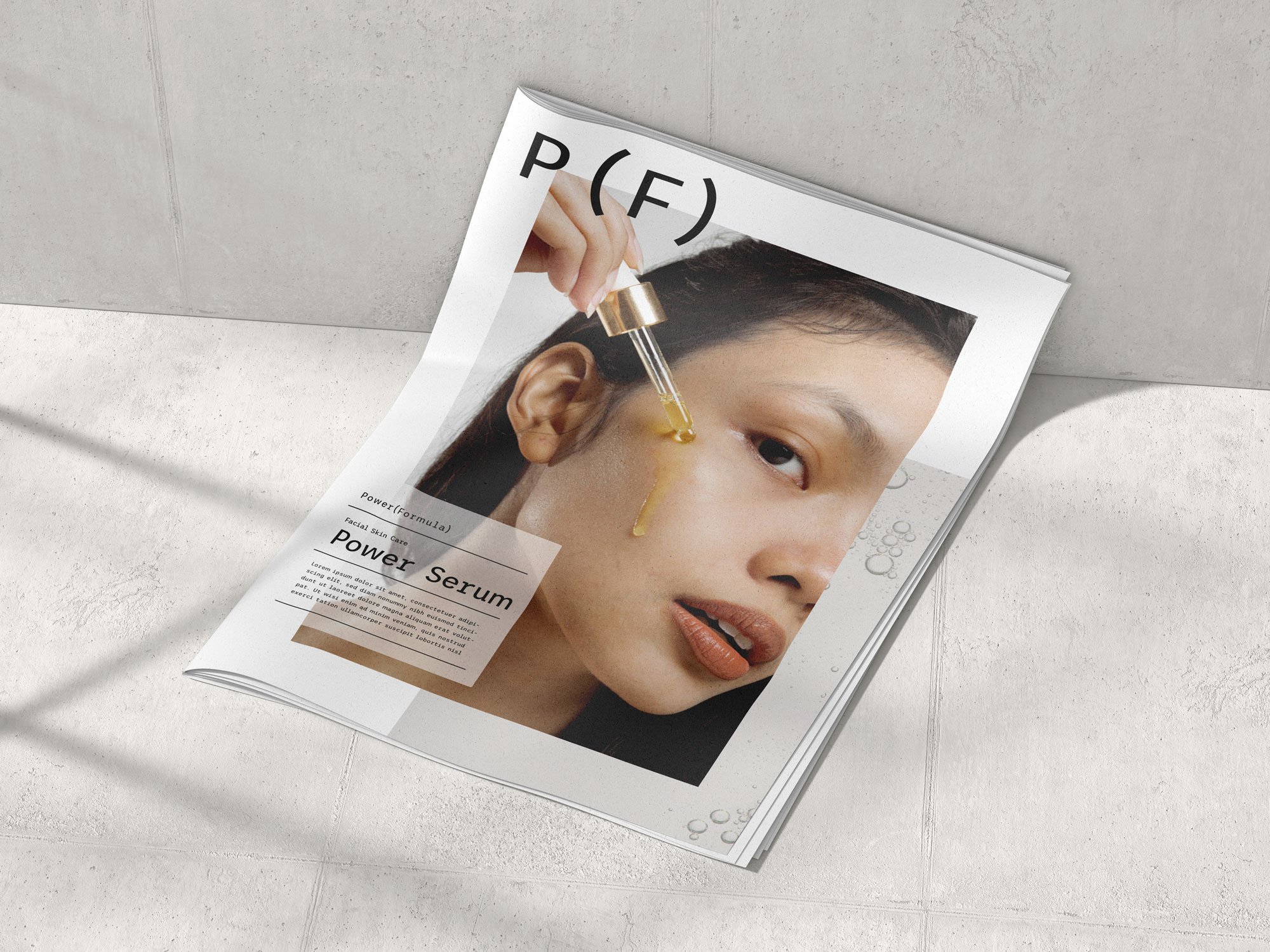
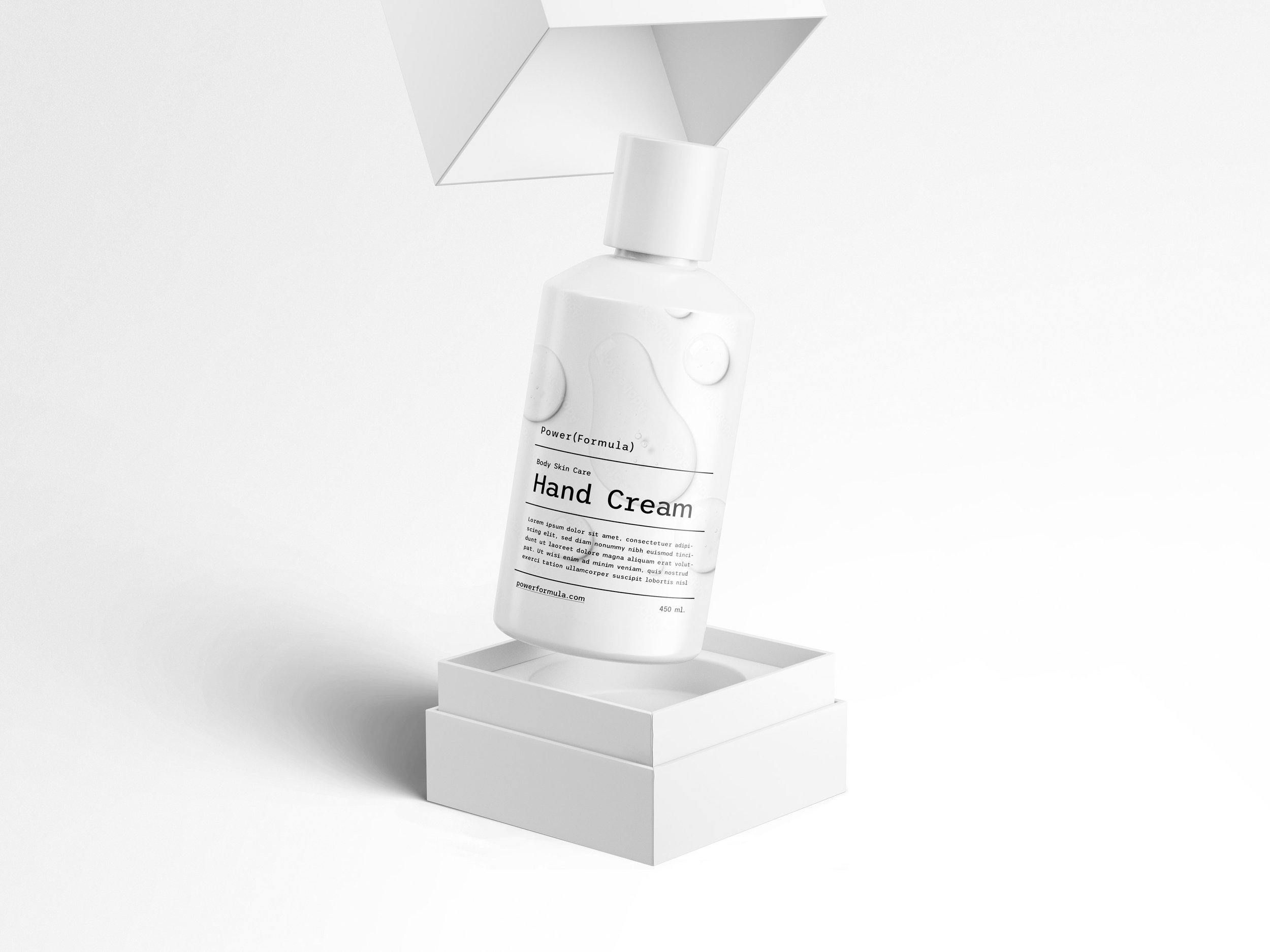
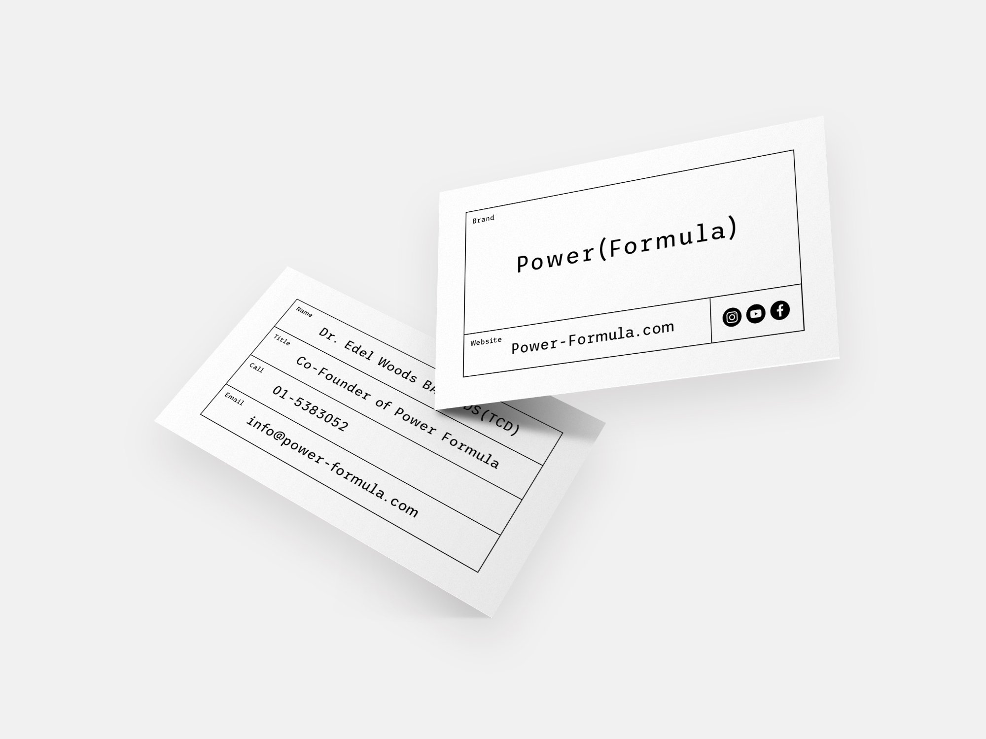
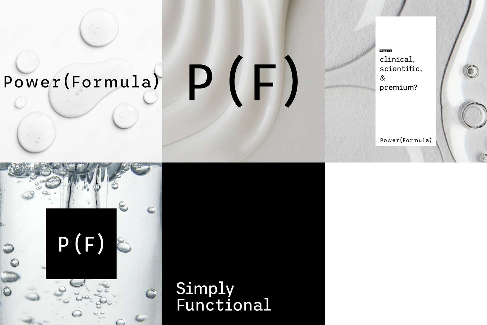
Crafted with meticulous attention to detail and meaningful intent, the brand's name and logo flawlessly encapsulate its scientific underpinning. Its sleek and functional design is unambiguous - this is a skincare brand devised by medical professionals, providing tangible, visible results. Drawing from the visual cues of pharmaceutical prescriptions, the typography reinforces the brand's credibility. The bracket designs, akin to mathematical symbols, underline the exactitude and proficiency behind this ground-breaking solution.
What we did:
Naming
Brand Positioning
Logo Design
Brand Identity
Packaging Direction
Embracing the Power of Simplicity
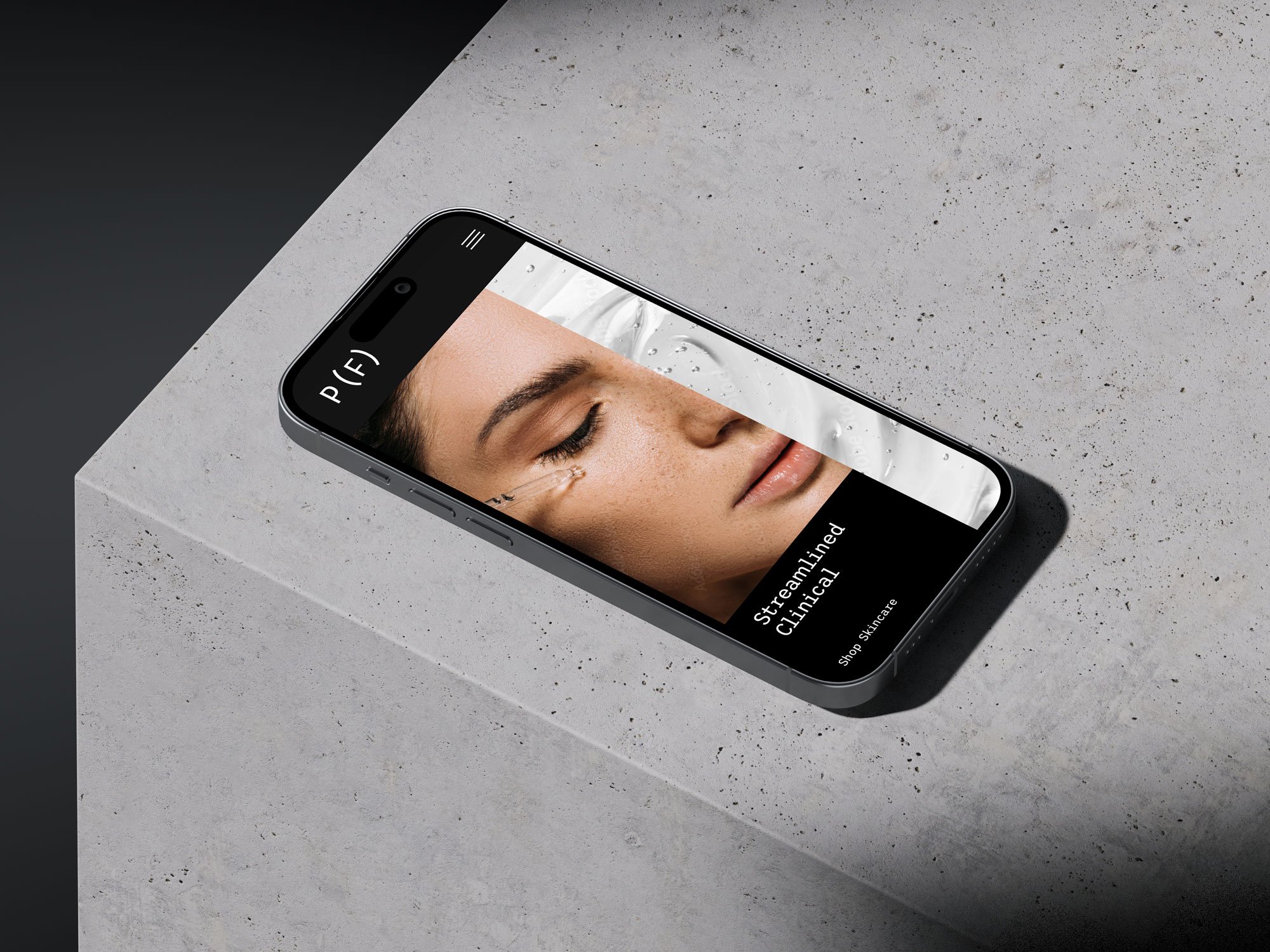
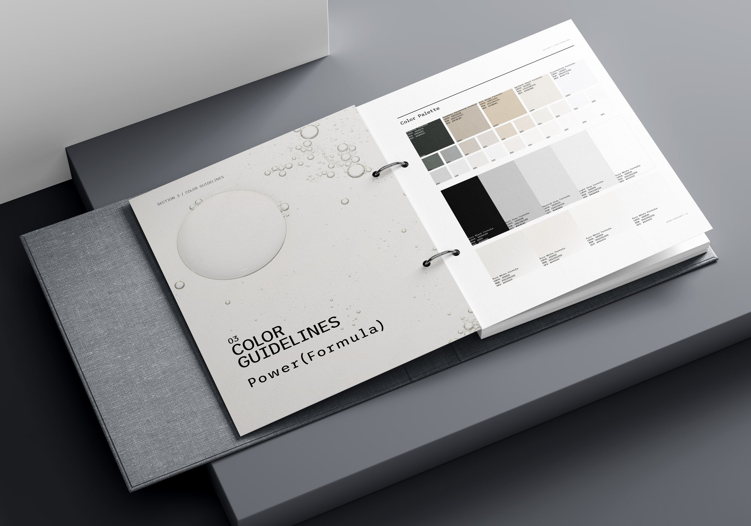
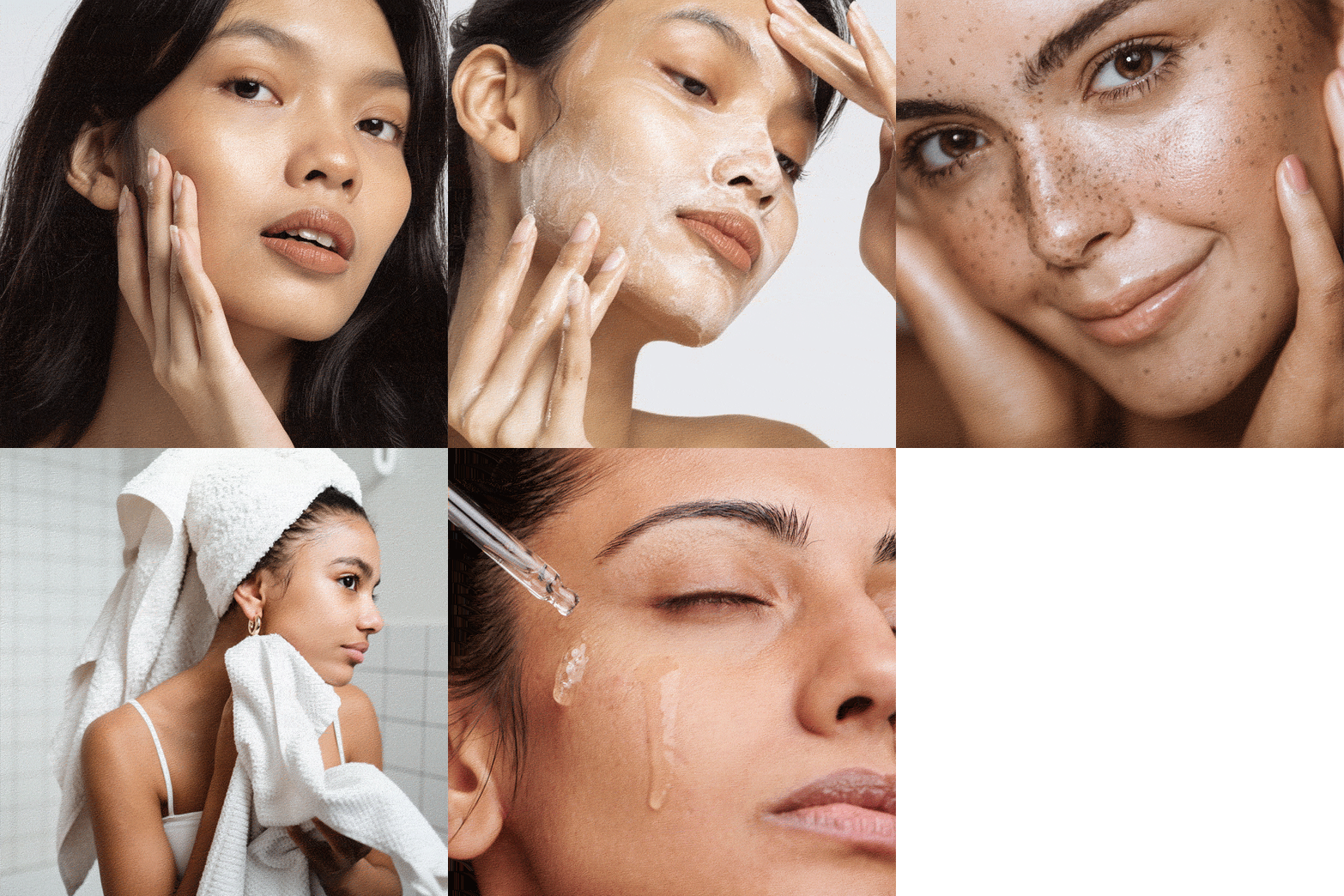
Designed to grace the shelves of aesthetic clinics and concocted by an aesthetic physician, this brand radiates premium quality with subtle sophistication. The visual brand overview zeros in on a warm, skin-centered design, championing minimalism. The muted color palette and brand components, influenced by medical prescriptions, provide clear guidance, exuding a blend of professionalism and simplicity. The technical monospace font imparts an authoritative vibe, which is beautifully counterbalanced by warm colors, encouraging you to indulge in the brand's welcoming aesthetic.
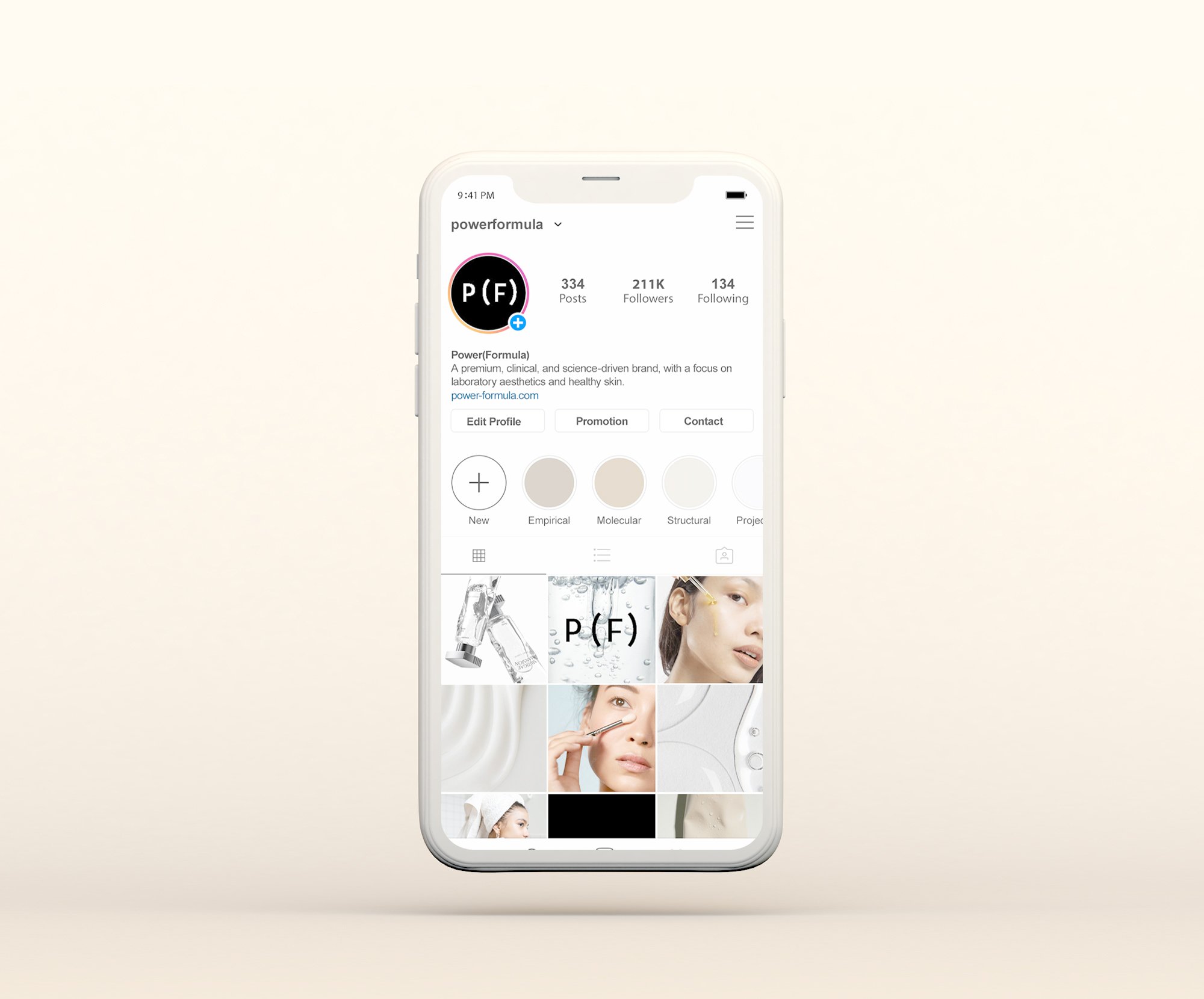
Our brand strategy hinges on a visual brand overview that harmonizes a warm, skin-centric design with a sleek, minimalistic foundation.
The branding is rooted in streamlined and subdued tones, with prescription-inspired graphics to provide clear information and guidance. This confers a professional, high-end appearance to the brand, signaling expertise and meticulous attention to detail. While the monospace font creates a clinical and authoritative atmosphere, it is softened by warm colors, ensuring the overall aesthetic remains inviting and well-balanced.
The color palette, primarily rooted in classic black and white, is enlivened by a spectrum of warm, golden skin tones. The introduction of dark forest green lends a premium touch, while cool gray ensures consistency across web and print materials. This palette is tailored to evoke a premium, clinical, and contemporary appeal, while maintaining the versatility and approachability we aim to manifest across the brand.
Pure Lashes
Brand Identity and Packaging Direction for Pure Lashes.
Crafting Organic and Eco-Friendly Lashes for Primark
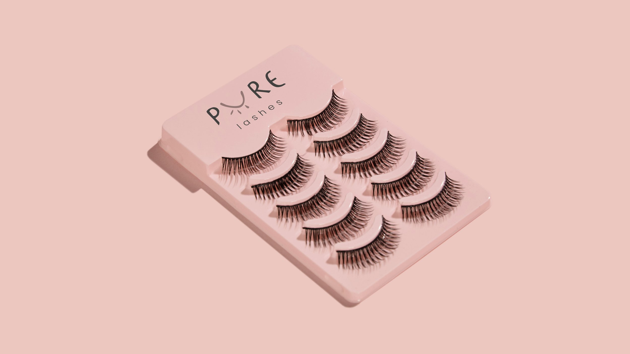
National Beauty, a renowned beauty company, approached our team with a clear vision: to develop an exclusive line of organic and sustainably packaged lashes for Primark, a leading retailer in the fashion industry.
In response to this ambitious goal, we set out to create a distinctive brand that would resonate with eco-conscious consumers while exuding playfulness and approachability. The heart of our brand lies in its name - a name carefully chosen to reflect our mission of crafting eyelashes that are not only organic but also thoughtfully packaged, minimizing any negative impact on the environment.
What we did:
Naming
Logo Design
Brand Identity
Packaging Direction
Crafting Eco-Friendly Beauty from Logo to Packaging
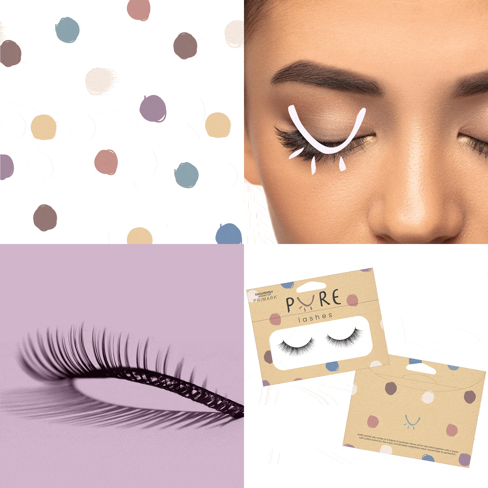
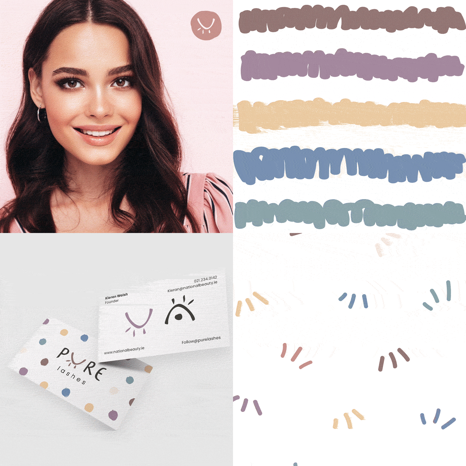
Delving into the creative process, we meticulously designed a captivating logo that seamlessly blends the elements of playfulness and authenticity. The logo's strokes and curves symbolize the natural beauty that lies at the core of our lash products, making it a true representation of our sustainable ethos.
As we strived for eco-friendliness in every aspect of our brand, we paid special attention to our packaging.
Each component was thoughtfully chosen to ensure it aligns with our commitment to preserving the environment, while still delivering a delightful unboxing experience for the customers. Using recycled and biodegradable materials, we incorporated our playful but earth-inspired palette onto the packaging.
The sustainable element of our brand extends beyond the lashes themselves. We embrace an eco-conscious approach throughout the entire packaging process, ensuring that every component reflects our dedication to preserving the environment.

The Wanted
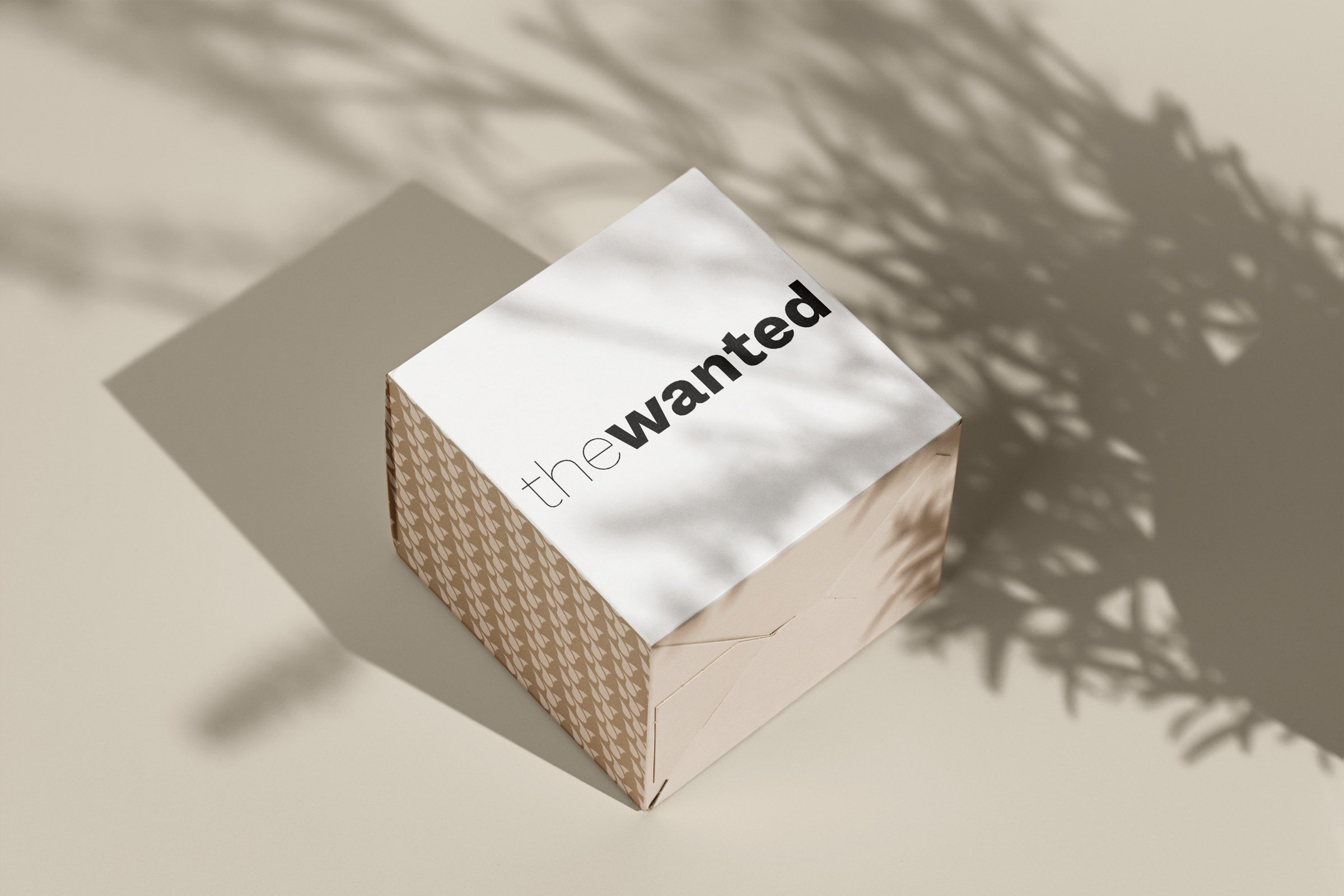
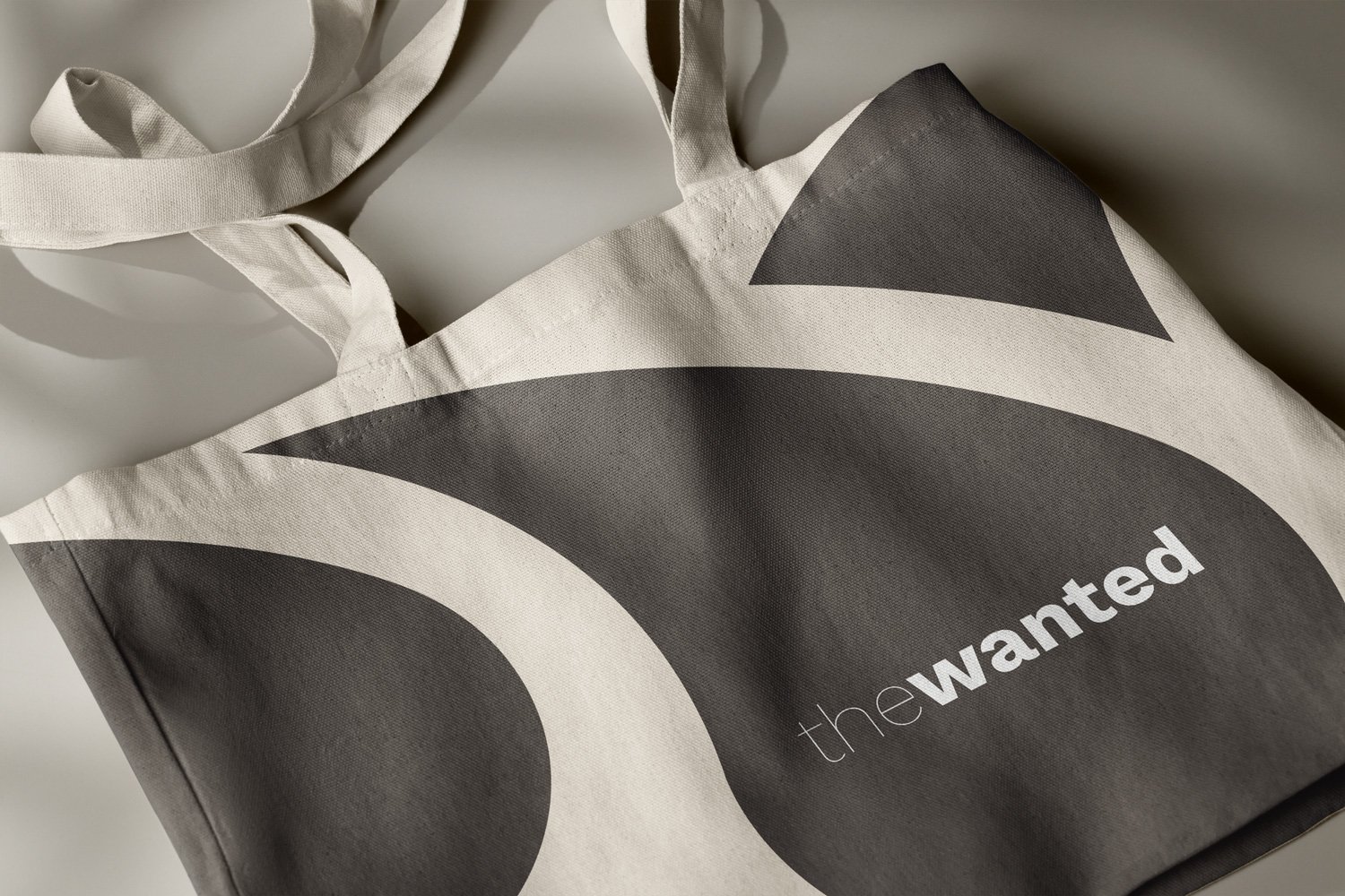
Brand Identity for The Wanted - Hair Care
Clean Hair, Clear Message: Welcome to 'The Wanted’
The Branded Agency crafted a groundbreaking haircare brand centered around scalp health - a niche that was previously overlooked in the market.
To set the brand apart from the competition and make it memorable, we brainstormed and came up with a catchy and unexpected name - "The Wanted." This moniker exudes a sense of allure and intrigue, perfectly capturing the essence of modernity and coolness that we envisioned for the brand.
Embracing simplicity and modern aesthetics, we designed the brand's identity with a sleek black and white theme. The logo, inspired by the very building blocks of hair, takes the form of an abstract hair follicle, symbolizing the brand's dedication to nourishing and caring for the scalp in a unique and effective way.
But that's not all - the heart of "The Wanted" goes beyond just appearance. We ensured that the products are formulated with the utmost care, using natural ingredients and cutting-edge technology to promote scalp health and enhance the overall haircare experience.
What we did:
Naming
Brand Positioning
Logo Design
Brand Identity
Packaging Direction
Clarity Labs
Brand Identity for Clarity Labs.
Introducing Clarity Labs: Where Bold and Clear Logo Design Meets Exceptional Packaging Solutions!
At The Branded, we crafted Clarity Labs' logo to be a perfect fit for their packaging requirements. This design seamlessly combines simplicity with elegance, allowing it to scale effortlessly and adapt flawlessly to various applications.
What we did:
Brand Identity
