Dyslexia Canada: ONlit
Logo Design and Graphic System for Dyslexia Canada ONlit
Empowering Ontario Teachers through a New Online Community for Language Curriculum Implementation
In a time of transformative change in education, Dyslexia Canada undertook an ambitious project to support Ontario teachers in their implementation of a new language curriculum. With the goal of creating a vibrant online community, our team was tasked with developing a sub-brand, ONLit, that will cater to elementary school teachers and grade nine English/French (first language) teachers. The envisioned website and brand will serve as a repository of invaluable resources, offer interactive learning modules, provide information about workshops and events, and foster moderated discussion forums.
We knew we had to infuse this initiative with a human touch, making it relatable and engaging for teachers. No more of the typical boring institutional vibe – this brand was going to be vibrant, approachable, and filled with personality. After all, supporting teachers in their vital role should be as enjoyable as it is meaningful.
ONLit's identity was purposefully designed to make reading accessible, enjoyable, and impactful. The core principle of fun, human-centered, and welcoming elements were interwoven into the brand's system. By creating an engaging and supportive environment, we aimed to lighten the load on teachers as they embrace these transformative changes.
Logo Design
Brand Identity
Template Design
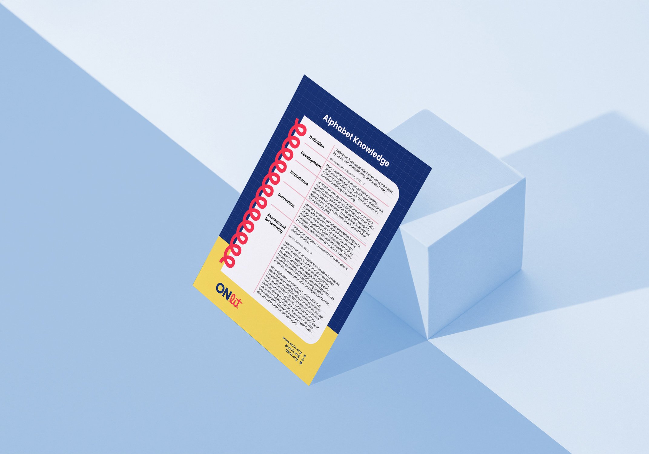
Brand Applications
Website Design
What We Did


Logo:
For ONLit's logo design strategy, we aimed to strike the perfect balance between fun and professionalism. The choice of the name "ONLit" was deliberate, as it cleverly encompasses various meanings in both English and French. In English, it can represent "Ontario Literacy" or simply "On Literacy," while in French, it translates to "We Read."
To ensure a fun touch, we incorporated vibrant and dynamic elements that resonate with a diverse audience, including teachers and students. The design exudes an air of excitement, encouraging a love for reading and learning. Playful colors and appealing imagery were employed to create an engaging visual experience.
At the same time, we were mindful of maintaining a professional tone to reflect the importance of education and the website's credibility. The font choice, layout, and overall design composition were carefully crafted to instill trust and convey a sense of reliability.
The Branded Agency's creative expertise came to life in the form of a groundbreaking brand for Dyslexia Canada's ONLit initiative.
Setting a new standard in design and reading for our future generation, the brand exudes innovation and inclusivity. By providing comprehensive assets and user-friendly templates, the agency ensured seamless branding across various touchpoints, making a critical application easily accessible to all. Together, Dyslexia Canada and The Branded Agency have taken a significant step forward in empowering children to read and shaping a brighter future for education.


